After the semester exams I got an break for few weeks. So I took that time to do a thing I wanted to do for a while now.
TrainBuddy was already looking nice. It’s already the best looking kid in the block of train schedule apps (in my opinion). But that doesn’t mean It can’t look nicer. So I took some time, read google design guides, checked the new support library and made some changes.
There are few notable changes.
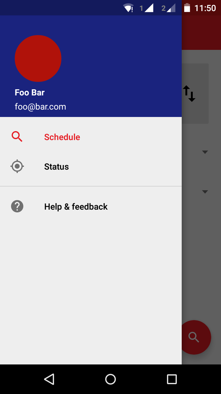
1.Navigational view.
The previous way of navigating (using the spinner) was kind of looked out of place, provided I needed add few options to the user (more options on the way). So the navigational view was the right choice. So with the support of android support library I added a navigational view to the app. Adding this was harder than I thought. Mainly because the use of One activity architecture. So I had to manually handle all the fragment transitions. So though the code is now full of hacks it works.
</br>
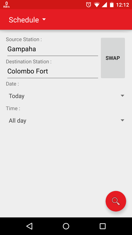
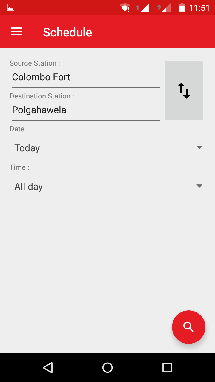
2.Typography in input providing view.
With the navigational view following the google design guidelines now the input providing view looked alien. I tried adding few icons. But it didn’t jell. So ended up changing the typography. And the new swap button has a icon now.
</br>
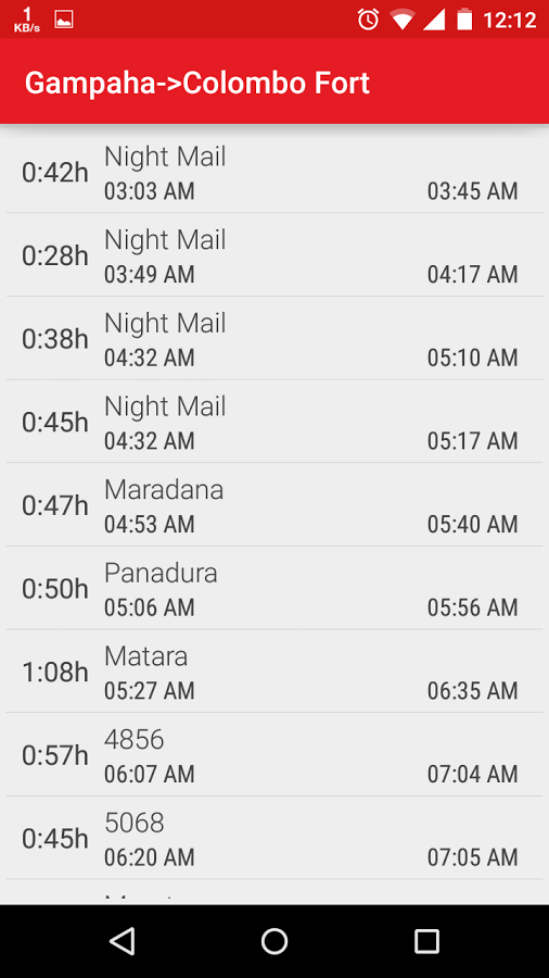
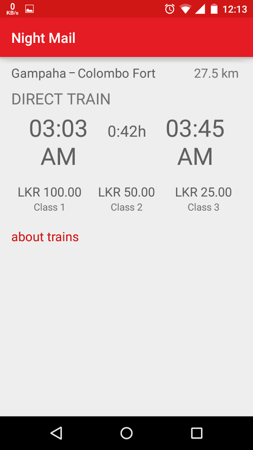
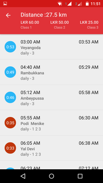
3.Result view layout and emission of journey detail view.(RIP detail view)
Here in list items I tried to get the look and feel of google inbox application. Also added the frequency and class availability to the list item. I also added the journey details to the result list view. because there isn’t much additional detail to view in a separate view after adding the frequency and class availability to the list item. And also journey detail is same for all the results per query. And the journey detail view was ugly and I couldn’t think of a way to fix it.
Another notable thing here is the view at the top of the window. Though it looks like the action bar it isn’t. It’s a linear layout with a navigation button. It’s because I couldn’t find a way to change the action bar layout for only one fragment. I was trying to add a collapsing toolbar here. But couldn’t find a way without changing the application architecture. I think the reason is the one activity architecture as I explained in previous post.
</br>
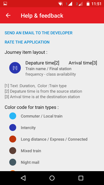
4.Addition of help & feedback view.
Since the list item layout got little complex here I added some explanations about it and provided means for users to contact the developer(that’s me ;)) through the application. Also added a link to rate the application.
</br>
Sadly I had to set the minimum Sdk level to 14 since some of the features are not available below sdk level 14. So this version will only be available for devices with ICS (Ice Cream Sandwich) and above.
All these changes are available for beta users now. If you are not a beta user yet join here and enjoy the new look. Non beta users will have to wait some time for the new release since there are few minor bugs to iron out.
If you haven’t try TrainBuddy yet get it from the Google play
Happy commuting !!!
UPDATE(28 July 2015) :Now available for all the users.